CGIS faculty and students have worked together to create two maps to show positive COVID-19 cases in the United States. Dr. Junchuan Fan and Yao Li have created the map visualizations. Hai Lan, Jeff Sauer, Zhiyue Xia, and Guimin Zhu also assisted with data collection, preprocessing and organization. Information about the maps and their currently hosted websites can be found below. The maps can also be accessed through our research tab above.
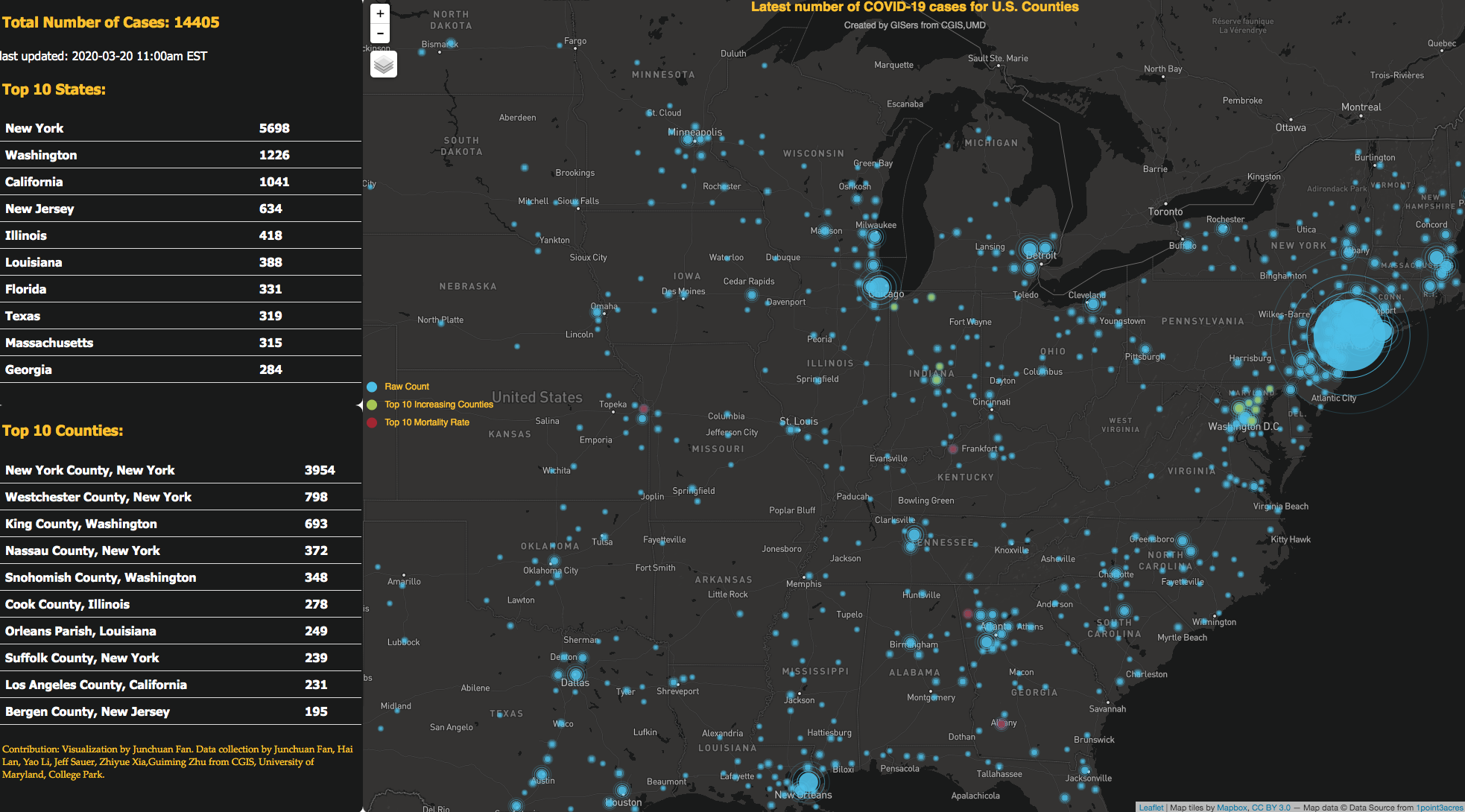
The point map shows the latest number of COVID-19 cases for U.S. counties. The left side shows the total number of cases, latest time stamp update, as well as the top 10 states and counties with the most reported positive cases. It was created using open source geovisualization tools including Leaflet, Mapbox and echarts. The data are downloaded from the Johns Hopkins University COVID-19 data repository on GitHub. Their data are collected from the latest news reports and then verified by volunteers. This map can be found at https://smart-spatial.com/ResearchProject/COVID_Count_US.html
Contribution: Visualization by Junchuan Fan, CGIS, University of Maryland, College Park.
Data source: Johns Hopkins University COVID-19 data repository
.png)
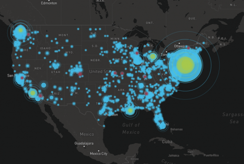
The polygon map shows a timeline of positive COVID-19 cases across the US. The user can toggle the bar across the bottom of the map to change the date and see the total number of cases on a particular day, with a visualization of the positive cases that darken in color as the numbers rise. The map was created CGIS graduate student Yao Li and also uses data from the Johns Hopkins University COVID-19 data repository on GitHub. D3 is used for the visualization of the data. This map can be found at https://mgzjys.github.io/US_Covid19_County/map/index.html
Contribution: Visualization by Yao Li. Data collection also assisted by Junchuan Fan, Hai Lan, Yao Li, Jeff Sauer, Zhiyue Xia, Guimin Zhu from CGIS, University of Maryland, College Park
Data source: Johns Hopkins University COVID-19 data repository